The Color Psychology Chart Every Brand Needs in 2026
Backed by peer-reviewed research and 11 real brand case studies — Apple, Coca-Cola, Tiffany & Co., IBM, and more — this is the myth-free guide to choosing colors that fit your brand, not just colors that are trending.
What Is Color Psychology in Marketing?
Color psychology in marketing is the study of how color choices shape perception, recall, and trust toward a brand. It sounds simple — until you notice that two competitors can use the exact same red and get completely different results.
That's because color doesn't carry one fixed meaning. The strongest research on the subject agrees on one thing above all: a color works because of how well it fits a brand's personality, category, and audience — not because that hue has some universal psychological effect on everyone who sees it. This guide walks through what the actual research says, what 11 brands prove about color in practice, and how to apply it to your own brand without falling for the oversimplified color-emotion charts that circulate online.
Why Color Still Matters in 2026
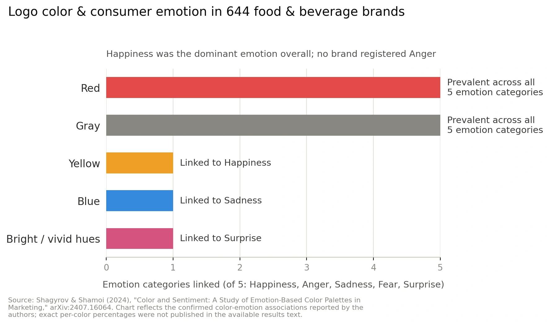
Attention is the scarcest resource in marketing, and color is processed before a single word is read. A 2024 analysis of 644 food brands and more than 30,000 Google Maps reviews found measurable links between a logo's dominant color and how customers described their experience — for example, yellow showed up alongside language tied to happiness, and blue alongside more negative sentiment, in that specific dataset.
The researchers were careful to note these patterns were tied to that category and context, not universal laws. That's the real takeaway for 2026: color still moves the needle, but only when it's chosen for your category and audience, not copied from a chart.
The Science Behind Color Psychology
Four studies marketers and researchers cite again and again — and what they actually conclude (it's rarely "X color means Y").
Labrecque & Milne
Often called the "Exciting Red, Competent Blue" study. It shows color shapes perceived brand personality and purchase intent — but the effect depends entirely on whether the color fits the brand, not on any fixed meaning.
Elliot & Maier
A comprehensive Annual Review of Psychology paper concluding there is no single universal emotional meaning attached to any color — effects shift with context and culture.
Satyendra Singh
Found color plays a major role in shaping first impressions of a product within seconds — while stressing that appropriateness to the product matters more than any specific hue.
Singh & Srivastava
A review of how demographics, culture, personality, and prior experience all shape color perception — the academic basis for why global brands localize their color choices market by market.
This is also why color comes up constantly in color psychology in business consulting work: the useful question in a strategy engagement is never "what does blue mean," it's "does this color match what we're trying to signal to this specific audience."
4 Color Psychology Myths You Should Stop Believing
Blue is widely liked, which is different from blue being inherently trustworthy. IBM and Meta both lean on blue, but trust is built through years of consistent delivery — the color just becomes the visual shorthand for it afterward.
Red increases visibility and urgency in the right context (a clearance sticker, a "buy now" button against a light page). On a page that's already red, the same button can disappear. Contrast drives the effect, not the hue alone.
Green reads as "sustainable" mainly because so many environmental brands have used it for decades — it's a learned industry convention, not a property of the wavelength itself.
Category convention is a starting point, not a rule. Standing out from a sea of same-colored competitors is often a stronger move than blending in with the "expected" palette.
The Color Psychology Chart: What Each Color Tends to Communicate
Treat this as a starting point for a conversation about your brand — not a rulebook. Every entry below depends on contrast, category, and culture to actually land.
Red
#D7263DEnergy, urgency, appetite. Common in food, retail clearance, entertainment. Needs strong contrast to read as a call to action — otherwise it blends into the noise.
Navy Blue
#08142AStability, authority, trust. The default "safe" choice in finance, insurance, and B2B tech — works reliably, but can read as generic without a distinct accent color.
Blue
#3B82C4Calm and dependable. Consistently the most "liked" color in global surveys — which is exactly why so many brands use it, and why differentiation matters more than the hue itself.
Green
#2E8B57Growth, health, "go." Common in wellness, finance, and sustainability branding — the eco association comes from repeated industry use, not the wavelength itself.
Gold / Yellow
#F9A615Optimism, premium positioning, attention. A staple in finance, luxury, and hospitality — paired with a dark base like navy or black, it's long-standing shorthand for "premium without shouting."
Purple
#7C5CBFCreativity, imagination, distinction. Common in beauty, education, and SaaS. Historically tied to royalty due to dye scarcity — today it stands out mainly because so few competitors use it.
Pink
#E78AA9Warmth, approachability, playfulness. Tone changes the meaning fast — a soft pastel reads completely differently from a saturated hot pink.
White
#FFFFFFSimplicity, space, premium minimalism. Reads as "clean" in many Western contexts and as mourning in some others — one of the clearest proofs that color meaning isn't universal.
Grey
#8A93A6Neutral, balanced, professional. Common in consulting, automotive, and architecture — usually a supporting color rather than a brand's primary identity color.
Black
#16181DAuthority, exclusivity, sophistication. Pairs with almost any accent color, which is part of why it never goes out of style in luxury and premium tech.
Brand colors and chart values above are commonly cited approximations for illustration. Always confirm exact hex/Pantone values in each brand's official guidelines before commercial use.
Color Perception Isn't Universal: Gender, Culture & Context
Three real sources of variation explain most changes in color perception across people:
Biological differences
Red-green color vision deficiency is genetically X-linked, so it affects roughly 1 in 12 men of Northern European descent versus fewer than 1 in 200 women. That's a real, measurable biological difference in color perception between groups.
"Men like blue, women like pink" — overstated
Research comparing self-reported color preferences between groups generally finds smaller, more mixed effects than the pop-science version suggests, and the results are heavily confounded by marketing exposure and culture — pink-for-girls is a 20th-century commercial convention, not a hardwired trait. Treat strong claims here skeptically.
Cultural context
White signals purity at a Western wedding and mourning in some East Asian traditions. If your audience spans multiple regions, test your palette locally before assuming one chart applies everywhere.
11 Brand Case Studies That Prove Context Beats Color Charts
Same color charts, completely different outcomes — because none of these brands won on hue alone.
Spotify — Green
Instant recognizability and contrast against a category full of black-and-white app icons mattered far more than any inherent "green = calm" meaning.
Coca-Cola — Red
Decades of unbroken consistency built the association. The color didn't create the brand — repetition did.
Tiffany & Co. — Tiffany Blue
Used so exclusively and consistently that the color itself became enforceable brand equity — arguably the strongest single example of color-as-trademark.
UPS — Brown
A famously "unglamorous" color became a strength once tied consistently to reliability messaging — proof that color works through association, not built-in appeal.
McDonald's — Red & Yellow
The real strength of this pairing is roadside contrast and visibility from a distance, not a claimed effect on appetite.
Apple — Black, White, Silver
Minimal color does more identity work than a "signature hue" when paired with strict consistency in materials and typography.
Target — Red
Two unrelated retailers can both build huge equity on the same hue. What separates them is execution and consistency, not the color itself.
IBM — "Big Blue"
The same blue that can feel generic in a consumer logo feels reassuring in an enterprise sales context — audience and category change what a color signals.
Meta / Facebook — Blue
Reportedly influenced by Mark Zuckerberg's red-green color vision deficiency, blue being the richest color he could see clearly. A reminder that some brand-color decisions start as practical, not strategic — yet consistent use still built strong recognition.
Netflix — Red on Black
Contrast against a near-black interface does more work than the hue alone — the same red on a white background reads very differently.
Hyundai — Blue
Blue is common across automotive brands to signal innovation and dependability — it's the specific shade plus consistent application that built recognition, not "blue" in general.
Color Psychology in Business Consulting & Financial Branding
In B2B, professional services, and financial branding, color choices in pitch decks, dashboards, and digital products influence perceived credibility more than they do in everyday consumer marketing. A buyer evaluating a six-figure contract is reading your visual identity as a proxy for how seriously you'll handle their account.
Navy paired with gold — like the palette used on this very page — is a common choice in finance and consulting for exactly this reason: navy signals stability and gold signals premium positioning, and together they read as "trusted, but not cheap."

A/B Testing & Conversion Optimization: What the Data Really Shows
HubSpot, Visual Website Optimizer (VWO), and Performable have all published CTA-button color tests over the years. We're deliberately not repeating the specific lift percentages that circulate from these — many of those numbers are old, unverifiable, or stripped of their original context by the time they're recycled into list posts. Run your own test before trusting anyone's number, including ours.
What does hold up across these tests: the button that contrasts most with its surroundings tends to win — far more consistently than any specific "best" color.
Illustrative example only — not measured data
CTA
CTA
Bar heights are illustrative of the general pattern across published tests, not actual reported figures.
How to Choose the Right Brand Colors for Your Business
Start with brand personality, not a color wheel
Decide what your brand needs to feel like — premium, friendly, rigorous, playful — before picking any hue. The personality should choose the color, not the other way around.
Check category conventions, then decide to fit in or stand out
Know what your competitors use. Then make an intentional choice about whether matching the category builds trust faster, or whether standing out helps you get noticed.
Test contrast and accessibility, not just vibes
Check your palette against WCAG contrast ratios for text and buttons. A beautiful palette that fails accessibility standards loses customers before psychology even enters the picture.
Plan for physical applications early — including storefront awnings
Digital colors and physical materials behave differently. If you're applying brand colors to storefront awning design, a few practical rules matter: test fabric swatches in actual daylight, not under store lighting; stick to one or two core brand colors so the awning stays legible from the street; ask your fabricator about UV-resistant, fade-tested acrylic or vinyl-laminated fabric, since most awning colors visibly fade within 3–5 years outdoors; and coordinate the awning color with your window vinyl and signage so the whole storefront reads as one identity, not three.
Localize for global or multicultural audiences
If you operate across regions, test your palette's associations locally rather than assuming your home market's reaction is universal.
Lock it into written brand guidelines
Document exact hex, CMYK, and Pantone values, plus approved pairings, so every vendor — from your web developer to your awning fabricator — uses the same colors.
Common Mistakes Businesses Make When Choosing Brand Colors
Chasing seasonal color trends instead of long-term consistency.
Ignoring contrast and accessibility in favor of how a palette "feels."
Copying a competitor's colors instead of deciding to differentiate on purpose.
Assuming a color has one universal meaning across every audience and culture.
Approving colors on a screen only, then discovering they look completely different in print, fabric, or signage.
Never writing the palette down — so every new vendor picks a slightly different shade.
Frequently Asked Questions About Color Psychology in Branding
The Color Psychology Chart Every Brand Needs in 2026
Backed by peer-reviewed research and 11 real brand case studies — Apple, Coca-Cola, Tiffany & Co., IBM, and more — this is the myth-free guide to choosing colors that fit your brand, not just colors that are trending.
What Is Color Psychology in Marketing?
Color psychology in marketing is the study of how color choices shape perception, recall, and trust toward a brand. It sounds simple — until you notice that two competitors can use the exact same red and get completely different results.
That's because color doesn't carry one fixed meaning. The strongest research on the subject agrees on one thing above all: a color works because of how well it fits a brand's personality, category, and audience — not because that hue has some universal psychological effect on everyone who sees it. This guide walks through what the actual research says, what 11 brands prove about color in practice, and how to apply it to your own brand without falling for the oversimplified color-emotion charts that circulate online.
Why Color Still Matters in 2026
Attention is the scarcest resource in marketing, and color is processed before a single word is read. A 2024 analysis of 644 food brands and more than 30,000 Google Maps reviews found measurable links between a logo's dominant color and how customers described their experience — for example, yellow showed up alongside language tied to happiness, and blue alongside more negative sentiment, in that specific dataset.
The researchers were careful to note these patterns were tied to that category and context, not universal laws. That's the real takeaway for 2026: color still moves the needle, but only when it's chosen for your category and audience, not copied from a chart.
The Science Behind Color Psychology
Four studies marketers and researchers cite again and again — and what they actually conclude (it's rarely "X color means Y").
Labrecque & Milne
Often called the "Exciting Red, Competent Blue" study. It shows color shapes perceived brand personality and purchase intent — but the effect depends entirely on whether the color fits the brand, not on any fixed meaning.
Elliot & Maier
A comprehensive Annual Review of Psychology paper concluding there is no single universal emotional meaning attached to any color — effects shift with context and culture.
Satyendra Singh
Found color plays a major role in shaping first impressions of a product within seconds — while stressing that appropriateness to the product matters more than any specific hue.
Singh & Srivastava
A review of how demographics, culture, personality, and prior experience all shape color perception — the academic basis for why global brands localize their color choices market by market.
This is also why color comes up constantly in color psychology in business consulting work: the useful question in a strategy engagement is never "what does blue mean," it's "does this color match what we're trying to signal to this specific audience."
4 Color Psychology Myths You Should Stop Believing
Blue is widely liked, which is different from blue being inherently trustworthy. IBM and Meta both lean on blue, but trust is built through years of consistent delivery — the color just becomes the visual shorthand for it afterward.
Red increases visibility and urgency in the right context (a clearance sticker, a "buy now" button against a light page). On a page that's already red, the same button can disappear. Contrast drives the effect, not the hue alone.
Green reads as "sustainable" mainly because so many environmental brands have used it for decades — it's a learned industry convention, not a property of the wavelength itself.
Category convention is a starting point, not a rule. Standing out from a sea of same-colored competitors is often a stronger move than blending in with the "expected" palette.
The Color Psychology Chart: What Each Color Tends to Communicate
Treat this as a starting point for a conversation about your brand — not a rulebook. Every entry below depends on contrast, category, and culture to actually land.
Red
#D7263DEnergy, urgency, appetite. Common in food, retail clearance, entertainment. Needs strong contrast to read as a call to action — otherwise it blends into the noise.
Navy Blue
#08142AStability, authority, trust. The default "safe" choice in finance, insurance, and B2B tech — works reliably, but can read as generic without a distinct accent color.
Blue
#3B82C4Calm and dependable. Consistently the most "liked" color in global surveys — which is exactly why so many brands use it, and why differentiation matters more than the hue itself.
Green
#2E8B57Growth, health, "go." Common in wellness, finance, and sustainability branding — the eco association comes from repeated industry use, not the wavelength itself.
Gold / Yellow
#F9A615Optimism, premium positioning, attention. A staple in finance, luxury, and hospitality — paired with a dark base like navy or black, it's long-standing shorthand for "premium without shouting."
Purple
#7C5CBFCreativity, imagination, distinction. Common in beauty, education, and SaaS. Historically tied to royalty due to dye scarcity — today it stands out mainly because so few competitors use it.
Pink
#E78AA9Warmth, approachability, playfulness. Tone changes the meaning fast — a soft pastel reads completely differently from a saturated hot pink.
White
#FFFFFFSimplicity, space, premium minimalism. Reads as "clean" in many Western contexts and as mourning in some others — one of the clearest proofs that color meaning isn't universal.
Grey
#8A93A6Neutral, balanced, professional. Common in consulting, automotive, and architecture — usually a supporting color rather than a brand's primary identity color.
Black
#16181DAuthority, exclusivity, sophistication. Pairs with almost any accent color, which is part of why it never goes out of style in luxury and premium tech.
Brand colors and chart values above are commonly cited approximations for illustration. Always confirm exact hex/Pantone values in each brand's official guidelines before commercial use.
Color Perception Isn't Universal: Gender, Culture & Context
Three real sources of variation explain most changes in color perception across people:
Biological differences
Red-green color vision deficiency is genetically X-linked, so it affects roughly 1 in 12 men of Northern European descent versus fewer than 1 in 200 women. That's a real, measurable biological difference in color perception between groups.
"Men like blue, women like pink" — overstated
Research comparing self-reported color preferences between groups generally finds smaller, more mixed effects than the pop-science version suggests, and the results are heavily confounded by marketing exposure and culture — pink-for-girls is a 20th-century commercial convention, not a hardwired trait. Treat strong claims here skeptically.
Cultural context
White signals purity at a Western wedding and mourning in some East Asian traditions. If your audience spans multiple regions, test your palette locally before assuming one chart applies everywhere.
11 Brand Case Studies That Prove Context Beats Color Charts
Same color charts, completely different outcomes — because none of these brands won on hue alone.
Spotify — Green
Instant recognizability and contrast against a category full of black-and-white app icons mattered far more than any inherent "green = calm" meaning.
Coca-Cola — Red
Decades of unbroken consistency built the association. The color didn't create the brand — repetition did.
Tiffany & Co. — Tiffany Blue
Used so exclusively and consistently that the color itself became enforceable brand equity — arguably the strongest single example of color-as-trademark.
UPS — Brown
A famously "unglamorous" color became a strength once tied consistently to reliability messaging — proof that color works through association, not built-in appeal.
McDonald's — Red & Yellow
The real strength of this pairing is roadside contrast and visibility from a distance, not a claimed effect on appetite.
Apple — Black, White, Silver
Minimal color does more identity work than a "signature hue" when paired with strict consistency in materials and typography.
Target — Red
Two unrelated retailers can both build huge equity on the same hue. What separates them is execution and consistency, not the color itself.
IBM — "Big Blue"
The same blue that can feel generic in a consumer logo feels reassuring in an enterprise sales context — audience and category change what a color signals.
Meta / Facebook — Blue
Reportedly influenced by Mark Zuckerberg's red-green color vision deficiency, blue being the richest color he could see clearly. A reminder that some brand-color decisions start as practical, not strategic — yet consistent use still built strong recognition.
Netflix — Red on Black
Contrast against a near-black interface does more work than the hue alone — the same red on a white background reads very differently.
Hyundai — Blue
Blue is common across automotive brands to signal innovation and dependability — it's the specific shade plus consistent application that built recognition, not "blue" in general.
Color Psychology in Business Consulting & Financial Branding
In B2B, professional services, and financial branding, color choices in pitch decks, dashboards, and digital products influence perceived credibility more than they do in everyday consumer marketing. A buyer evaluating a six-figure contract is reading your visual identity as a proxy for how seriously you'll handle their account.
Navy paired with gold — like the palette used on this very page — is a common choice in finance and consulting for exactly this reason: navy signals stability and gold signals premium positioning, and together they read as "trusted, but not cheap."
A/B Testing & Conversion Optimization: What the Data Really Shows
HubSpot, Visual Website Optimizer (VWO), and Performable have all published CTA-button color tests over the years. We're deliberately not repeating the specific lift percentages that circulate from these — many of those numbers are old, unverifiable, or stripped of their original context by the time they're recycled into list posts. Run your own test before trusting anyone's number, including ours.
What does hold up across these tests: the button that contrasts most with its surroundings tends to win — far more consistently than any specific "best" color.
Illustrative example only — not measured data
CTA
CTA
Bar heights are illustrative of the general pattern across published tests, not actual reported figures.
How to Choose the Right Brand Colors for Your Business
Start with brand personality, not a color wheel
Decide what your brand needs to feel like — premium, friendly, rigorous, playful — before picking any hue. The personality should choose the color, not the other way around.
Check category conventions, then decide to fit in or stand out
Know what your competitors use. Then make an intentional choice about whether matching the category builds trust faster, or whether standing out helps you get noticed.
Test contrast and accessibility, not just vibes
Check your palette against WCAG contrast ratios for text and buttons. A beautiful palette that fails accessibility standards loses customers before psychology even enters the picture.
Plan for physical applications early — including storefront awnings
Digital colors and physical materials behave differently. If you're applying brand colors to storefront awning design, a few practical rules matter: test fabric swatches in actual daylight, not under store lighting; stick to one or two core brand colors so the awning stays legible from the street; ask your fabricator about UV-resistant, fade-tested acrylic or vinyl-laminated fabric, since most awning colors visibly fade within 3–5 years outdoors; and coordinate the awning color with your window vinyl and signage so the whole storefront reads as one identity, not three.
Localize for global or multicultural audiences
If you operate across regions, test your palette's associations locally rather than assuming your home market's reaction is universal.
Lock it into written brand guidelines
Document exact hex, CMYK, and Pantone values, plus approved pairings, so every vendor — from your web developer to your awning fabricator — uses the same colors.
Common Mistakes Businesses Make When Choosing Brand Colors
Chasing seasonal color trends instead of long-term consistency.
Ignoring contrast and accessibility in favor of how a palette "feels."
Copying a competitor's colors instead of deciding to differentiate on purpose.
Assuming a color has one universal meaning across every audience and culture.
Approving colors on a screen only, then discovering they look completely different in print, fabric, or signage.
Never writing the palette down — so every new vendor picks a slightly different shade.